UNIT 43 M1
After posting my first draft of my project, I proceeded to
question a number of my peers to ask their opinions on any modifications that
could be made towards my design and layout to make it more user friendly.
After consulting them, the following corrections needed to
be addressed:
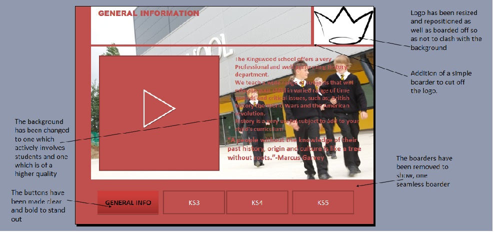
- The text on the slides needed to be bolder to make them easier
to read. As vision impaired users would find it hard to read the text some of which
is important to the purpose of subject advertisement.
- The boarders on each slide did not match and made the
design appear un-profession and tacky. The project would reflect the standard
the school delivers and thus must be high to show to potential students that
the school is one that will deliver.
- The logos needed to be resized and repositioned to make
them fit in more. As currently they are
too big and often draw attention away from the important sections of the
project.
- The background image was too blurry and needed to be
changed to a better quality one. The image was unclear and did not serve a
purpose in the project, a better quality vector image was needed to show the high,
professional standard needed.
- The hyper-linked buttons needed to be made clearer. As they
did not clearly look like hyper-linked buttons, they looked more like page references
Below are attached images of the modifications to the
design.
.jpg)
.jpg)
.jpg)
.jpg)
.jpg)
What went well (www): the development is very good you have annotated it well and you have covered the criteria for M1.
ReplyDelete